
REPORTS
Demo example showing how research reports can be reimagined as interactive web experiences, each built individually to match the original design, with data visualizations rebuilt for both web and print.

Landing page: mobile version

Landing page: desktop version
Integrated web-report
I'm a huge fan of the work from the World Inequality Lab, so I read their new report, the "Global Justice Report," with great interest. Seeing their findings alongside the data visualisations, I was eager to create an integrated version, so the reader doesn't have to jump between text and visualisations. Making the visualisations responsive also allows a new audience to read this content on any device in the train or on the sofa 😌
Highlighting & Annotation
In multiline charts, too many colors can overwhelm and confuse the audience. To address this, it's better to give users clear guidance on which line is the key one to focus on, rather than presenting all lines with equal visual weight.
A further adjustment involves making it clearly visible where a time series transitions from historical data into forecast/prediction. Annotations placed directly on the line, describing the current state versus the hoped-for future state, give readers an immediate, concrete example to anchor their understanding.

Original version
.png)
Reworked static version (check out the web version, which is interactive and adaptable to devices)
Color code
This reworked chart uses a deliberate color code to make its key message clear at a glance. Red highlights the dramatic gap between Africa and North America, the central comparison of the chart. Violet marks the current world average, a neutral anchor point. The other regions are shown in gray, since they're not the focus here, letting the main contrast stand out. Finally, green marks the target value, chosen to evoke hope and a goal worth striving toward.
This reworked version improves on the original chart, which didn't have a color code and left viewers to figure out on their own which comparison actually mattered. Assigning meaning to each color instead guides the eye straight to the point.

Original version
.png)
Reworked static version (check out the web version, which is interactive and adaptable to devices)
Declutter & readability
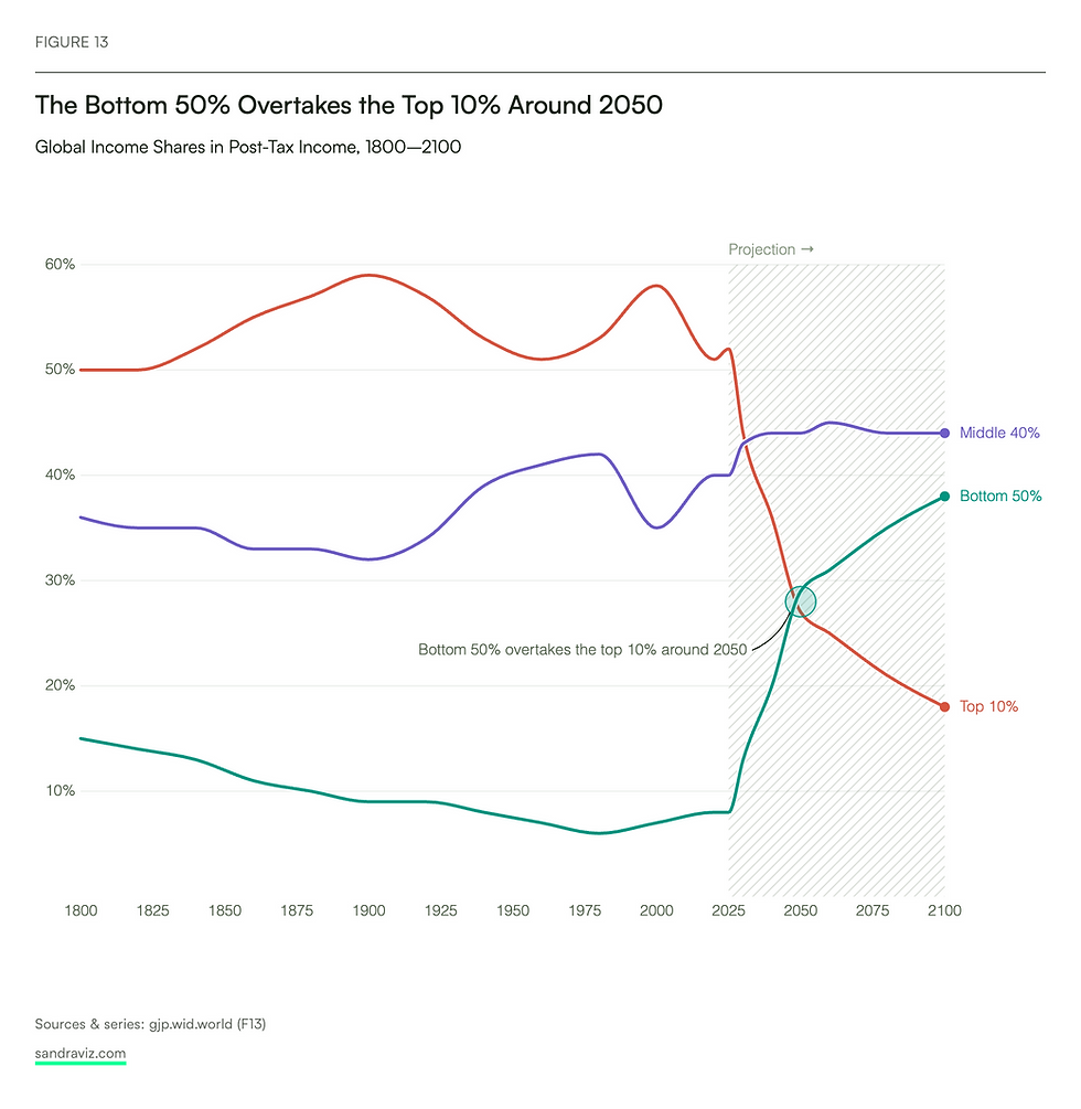
This chart rework focused primarily on decluttering, reducing the gridlines that were overpowering the actual trend the lines were meant to show. As with the other visualization, projections are clearly marked as such, and the decisive point that represents the chart's main message is highlighted: the moment when the bottom fifty exceeds the top ten.
Stylistically, it was also important that labels sit at the end of each line rather than in a separate legend, which greatly simplifies readability. You don't need to search for the line in a legend, you immediately see what each line represents, what it stands for, not in terms of importance, but in terms of which label belongs to it.

Original version
.png)
Reworked static version (check out the web version, which is interactive and adaptable to devices)
You send your report
You send your finished report, together with the data, the analysis remains yours.
I design and build it
I turn it into an interactive, visualization-first experience for web and mobile.
You get both
A hosted interactive version, plus every figure as a static file for your PDF.